This font is everywhere
Ever since I play around in Photoshop I installed font after font. Even now in game development I have to find shiny new fonts I could use. But one font always stood out to me:
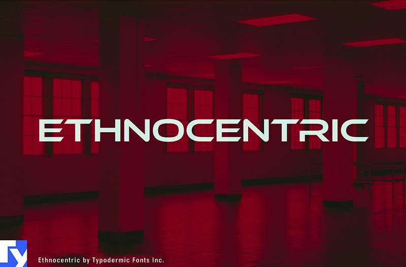
It began with a card game I developed in ~2008: a Command & Conquer, Tiberium era games inspired 2 player game. I used "Impact" for GDI and Ethnocentric for "The Brotherhood of Nod". Since that project, this font pops out to me everywhere. I´ve seen it on plumbers cars, hairsaloons, chinese takeout menus, greeting cards etc.
The idea of taking photos, when I see it and creating an album with it was in my mind for a long time and here is the perfect place to do that!
from dafont.com: Imagine a typeface that doesn’t just hint at the future—it hurtles towards it. That’s Ethnocentric, a font that embodies the relentless pace of technological advancement and scientific discovery.Allowed
- art
- sign
- poster
- banner
- book
- business card
- album
- movie
- television
- video/streaming/channels
- logo
- trademarked logo
- clothing
- sticker
- stamp
- product label
- web page (not embedded)
- app (not embedded)
- eBook cover or images (not embedded)
Not Allowed
- app (embedded)
- web page (embedded)
- eBook (embedded)
- product creation platform
- alphabet stamps
- advertisment server
- web template
- OEM
- device embedding
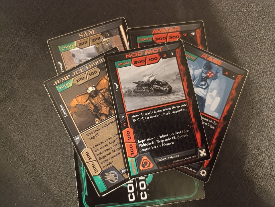
my Command & Conquer fan game
an online shop
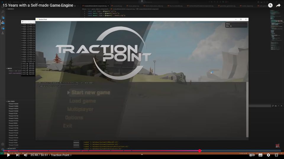
Madrigal Games "15 years with a self-made engine" >> youtube
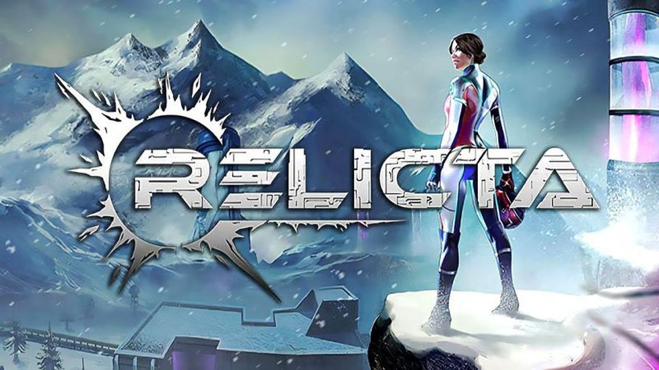
Relicta´s logo - a clever portal like puzzle game

This boardgame doesn´t change anything about the font...
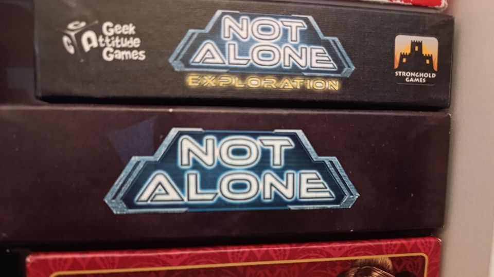
...while this incorporated it way more in the logo design. Still not as good as the examples above though.
I don´t know what´s going on with the "RE" and "ME" there?
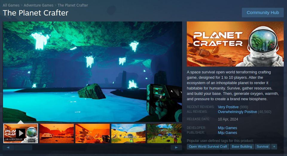
Planet Crafter: a game I´ve wishlisted for long and never bought.
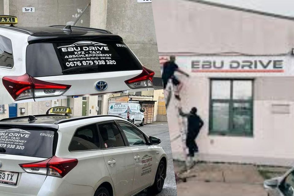
I saw this taxi in the city, my font senses tingled, but I was too slow with my phone camera. So I researched them and even found them be very happy with setting up their company house front^^
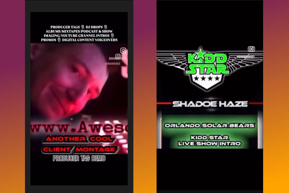
By chance - I swear - I came by this instagram user: DJ Shadoe Haze. Very weird one...
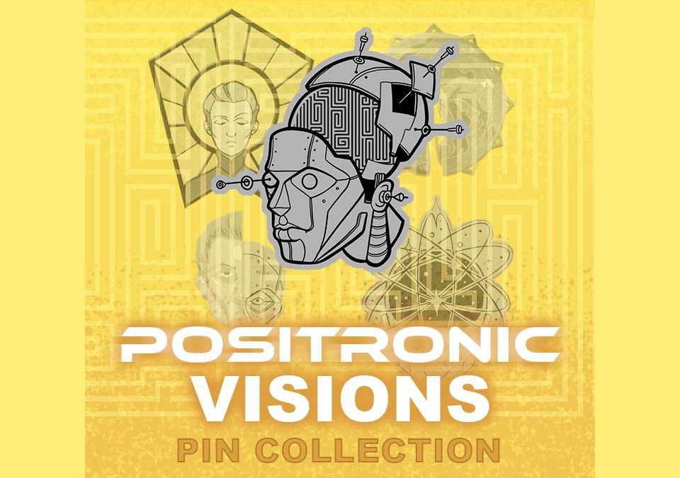
This is what I believe to be a bluesky Pin Collection?
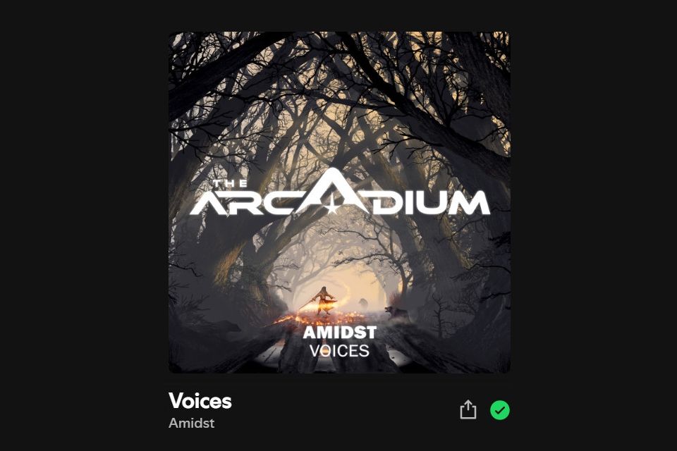
Daniel Knightley pointed this album cover out to me on bluesky. Which certainly uses this font, albeit it heavily modified to fit the Logo.
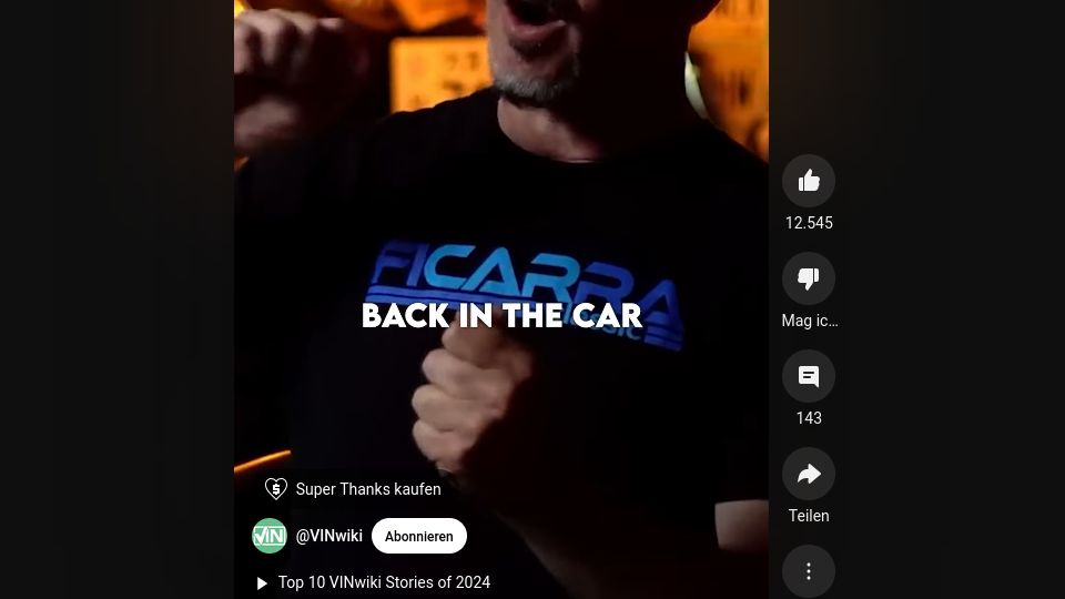
taken from a youtube short were a guy wore a t-shirt promoting Ficarra Classic
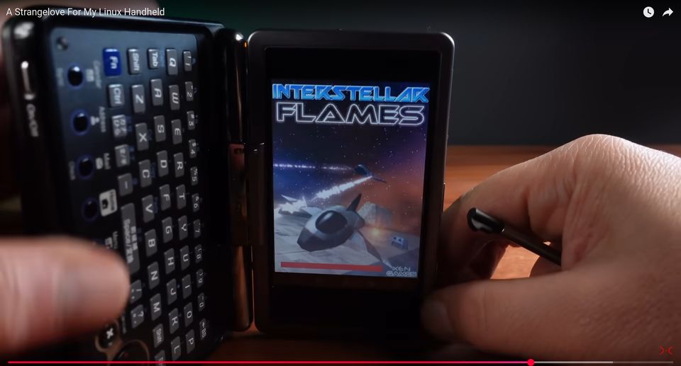
Janus Cycle showing off a truly tiny computer from yesteryears and suddenly I see this title screen!
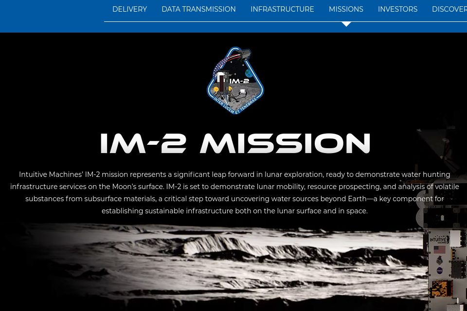
"Intuitive Machines’ IM-2 mission represents a significant leap forward in lunar exploration, ready to demonstrate water hunting infrastructure services on the Moon’s surface."
They use the font all over their website, but it does not like it would appear on their lunar lander. If this spacey font would actually be in space - it would be epic.
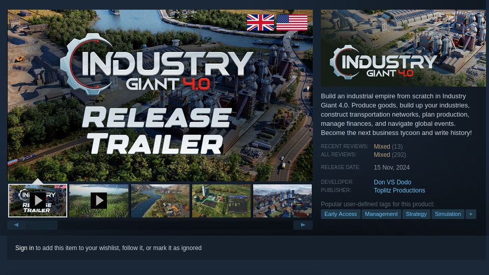
Another game, using the bold and hard edges of this font to drive home its setting and aesthetics.
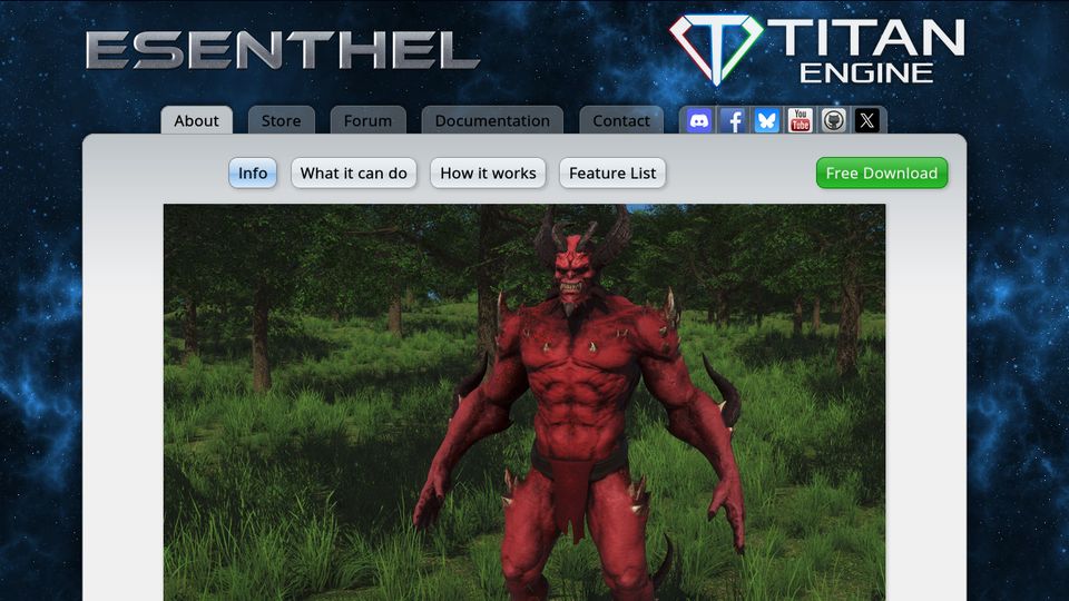
Esenthel claims to be the most powerful game engine in the world. I doubt it, but eh what do you know...^^
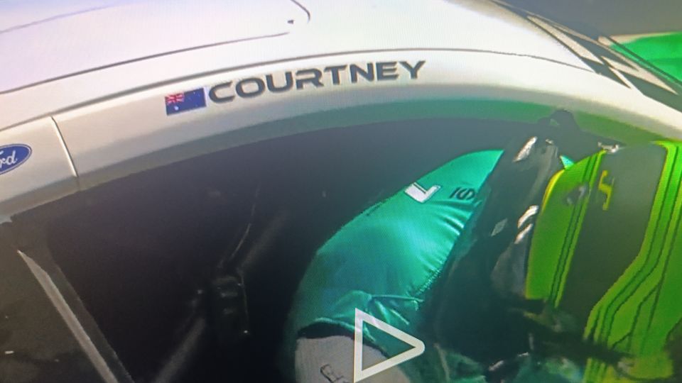
James Courtney is an australien supercar driver. I just found that by chance while watching F1.
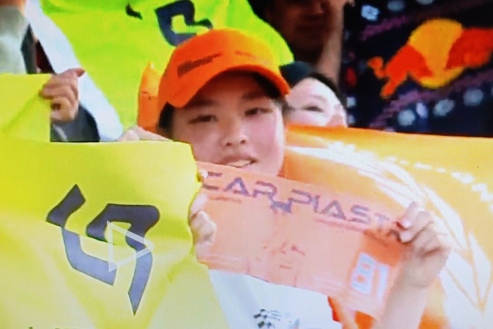
And a week later, at the Chinese F1 Grand Prix, this Oscar Piastri Fan appeared on screen :)
An ad in my feed - I think the search engines caught up to me and my liking of the font.
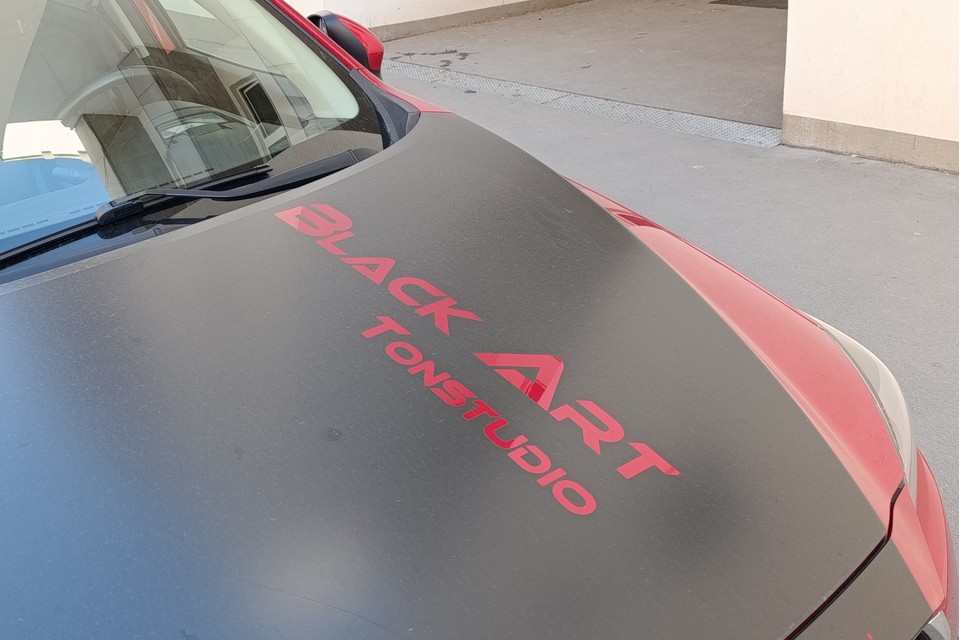
This car parked in front of my house. It has an ad for a recording studio on it.
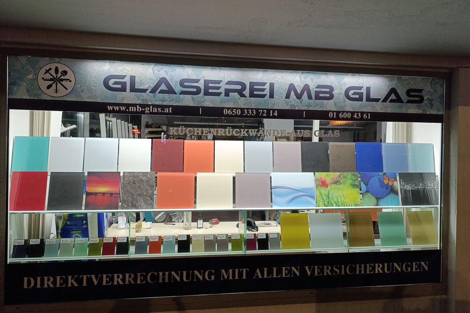
A shop front for a glass repair shop.
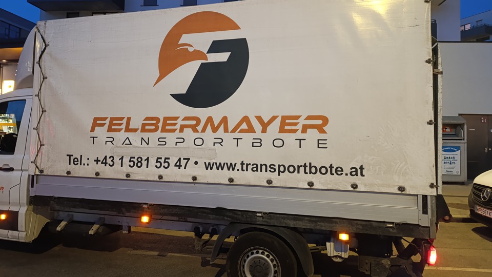
A courier service that could have used the same "F" in the logo and the wordmark, but chose not to do so.
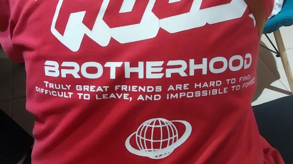
I don't remember anymore where I took this photo, but it could be an esports / LAN clan tee.
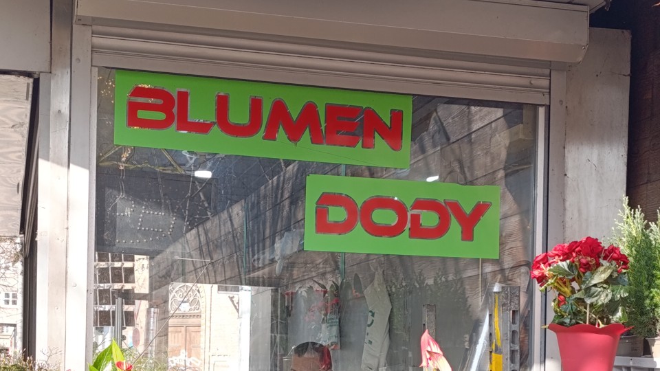
The flowershop on the way to my workplace. Impeccable font choice! XD
Read about the designers here.
Of course, dear onlooker, if you have examples of that font being used, send me a picture or note please! I would be glad to host it here with your credit :)
Socials
information duty following §5 E-Commerce Gesetz, §14 Unternehmensgesetzbuch, §63 Gewerbeordnung und Offenlegungspflicht laut §25 Mediengesetz in Austria
Ancient Pixel
Sebastian Merkl
1110 Vienna, Austria